The Clever Subliminal Messages Hiding in Your Favorite Brands
You probably see hundreds of logos every week and barely notice them. They flash across your phone screen, show up on delivery boxes, sit on your coffee cup, or pass by on a billboard. Most disappear from your mind in seconds.
But some of the world’s most recognizable brands have hidden smart design details inside their logos. These subtle touches are intentional. Designers build them in as quiet storytelling elements. Once you spot them, it’s hard to unsee them, and you’ll start looking at familiar logos a little differently.
FedEx
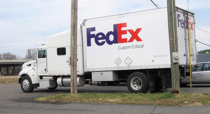
Credit: Wikimedia Commons
At first glance, the FedEx logo appears to be clean, modern typography in purple and orange. But the real magic lives in the negative space. Look between the capital E and the lowercase x. There’s a perfectly formed white arrow pointing forward. Designer Lindon Leader intentionally embedded it in 1994 to symbolize speed, precision, and forward motion. Most people don’t notice it immediately, but once you see it, though, it becomes impossible to ignore, which makes the logo far more memorable than simple text ever could.
Amazon
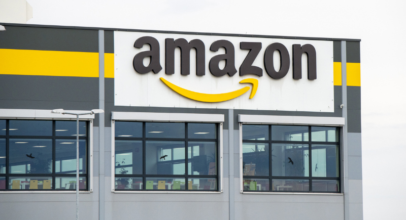
Credit: iStockphoto
Amazon’s curved yellow arrow does two jobs at once. First, it stretches from the letter A to the letter Z, reinforcing the company’s promise that it sells everything from A to Z. Second, the curve forms a subtle smile, and that smile matters. Branding experts often point out that positive emotional cues increase brand recall. Amazon doesn’t just want to signal product variety. It wants you to associate delivery day with satisfaction.
Toblerone
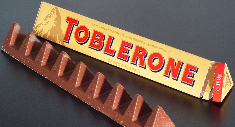
Credit: Wikimedia Commons
The Toblerone logo features the iconic Matterhorn mountain. But inside that mountain, hidden in the white negative space, is a bear standing upright. The bear references Bern, Switzerland—Toblerone’s birthplace—often called “The City of Bears.” The animal appears almost ghosted into the mountain’s side. It’s a subtle tribute to the origin. Instead of slapping a flag on the packaging, Toblerone wove its hometown into its design.
Baskin-Robbins
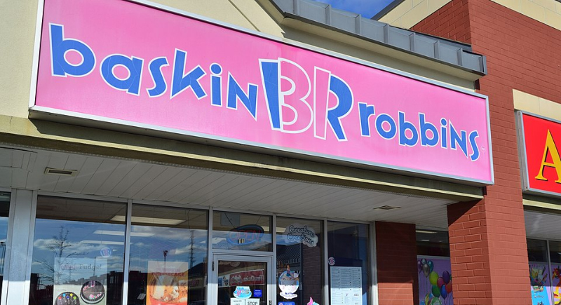
Credit: Wikimedia Commons
The Baskin-Robbins logo seems like simple pink and blue lettering, but the B and R form the number 31 in bright pink. That number dates back to 1953, when the company promoted 31 flavors, one for each day of the month. Today, the menu includes more than 1,400 flavors worldwide, yet even after the 2022 logo refresh, the hidden 31 remains, woven into the initials as a lasting nod to its roots.
Beats by Dre
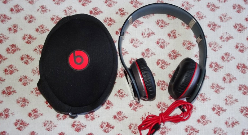
Credit: bbay
Beats by Dre uses a lowercase “b” inside a bold red circle, and that clean mark does more than spell a letter. The circle forms the outline of a human head, while the “b” becomes a headphone resting over one ear. Without showing a full pair of headphones, the logo still communicates exactly what the brand makes. The symbol turns the name itself into the listener, which makes the design feel purposeful and smart.
Tour de France
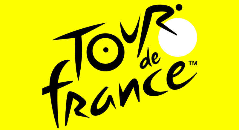
Credit: Facebook
The Tour de France logo has a playful, slightly abstract style, but the details are intentional. The letter “R” in “Tour” is shaped like a cyclist leaning forward over the handlebars, and the yellow circle works as both a sun and a bicycle wheel. Rather than adding a separate bike graphic, the designers wove the sport directly into the wordmark, so the race lives inside the name itself.
Sony Vaio
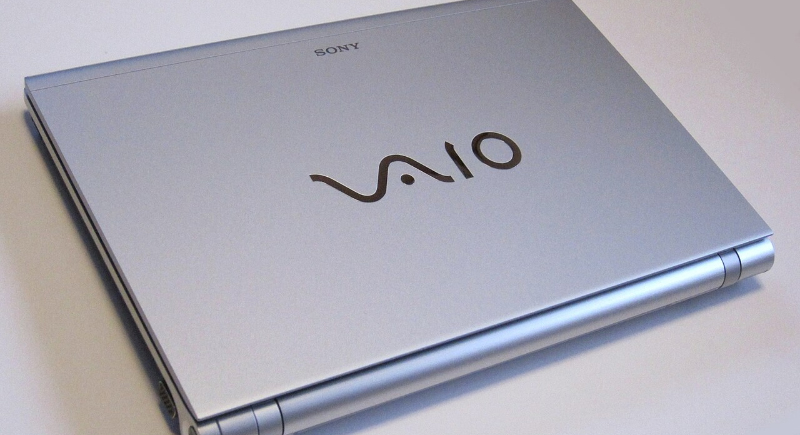
Credit: Wikimedia Commons
Sony’s Vaio logo is one of the smartest typography designs in tech branding. The “V” and “A” are shaped like an analog waveform, representing traditional audio signals. The “I” and “O” represent the binary digits 1 and 0, the very foundation of digital computing. The logo literally visualizes the transition from analog to digital technology and becomes more than just decorative.
Unilever
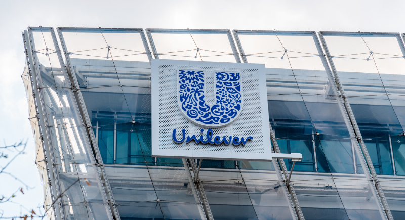
Credit: iStockphoto
Each symbol on Unilever’s large blue “U” represents a category within the company’s portfolio, from food to hygiene to sustainability initiatives. The company’s scale hides in plain sight. You’ll notice it’s packed with dozens of tiny icons. It has a spoon, a heart, a bird, water droplets, and leaves. Instead of listing its businesses, Unilever embeds them visually. The brand owns products ranging from Dove to Ben & Jerry’s, and the logo reflects that diversity.
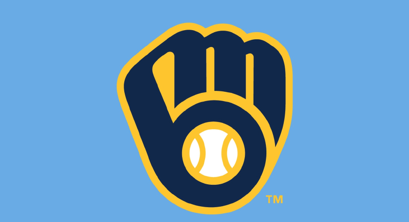
Milwaukee Brewers
Credit: Facebook
The Milwaukee Brewers logo looks like a simple baseball glove holding a ball, but the shape carries a clever secret. The glove’s curves form a lowercase “m” and “b” in negative space, the team’s initials hidden in plain sight. It works immediately as a classic baseball symbol, and then reveals a second layer for fans who notice the lettering built right into the design.
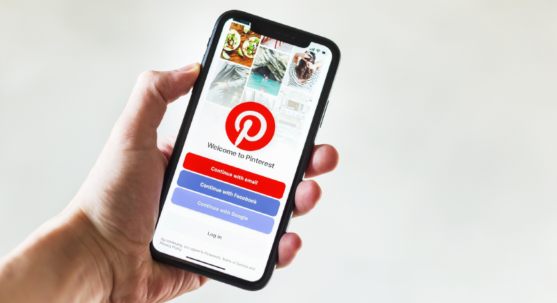
Pinterest
Credit: iStockphoto
Pinterest’s red circle contains what looks like a stylized capital “P.” But that letter doubles as a map pin, and it’s intentional. Pinterest is about pinning ideas onto digital boards, from recipes to outfits and home designs. So the action of the platform is built directly into its identity. Rather than placing a literal pin next to the brand name, the pin becomes the letter itself.