10 Color Psychology Strategies to Increase Real Estate Wealth and Conversion
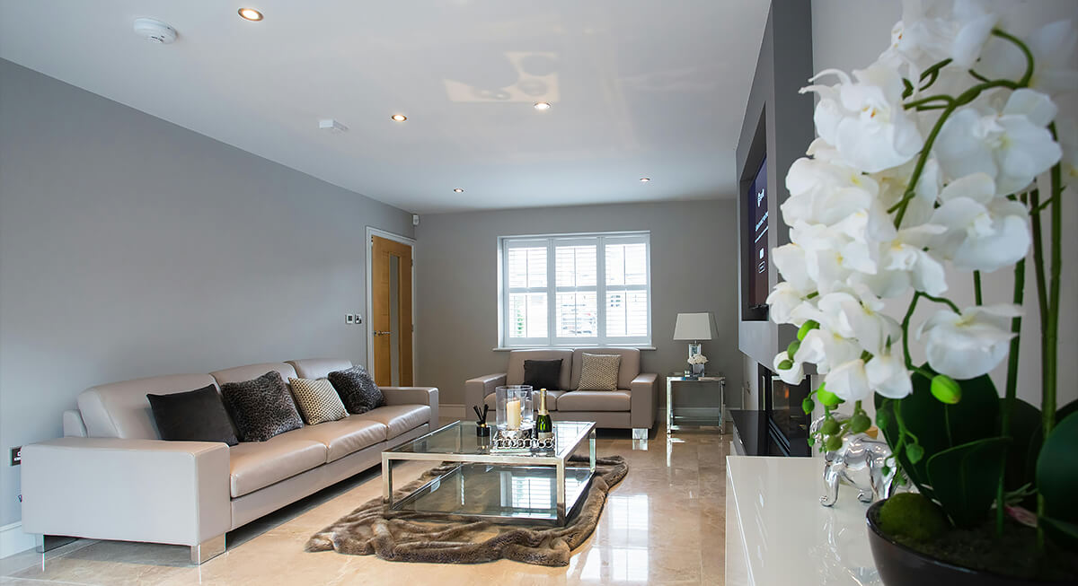
Color is more than just a finishing touch in real estate. It shapes how buyers judge a property before any other detail. Research shows color can drive up to 90% of snap impressions, which means the palette you choose directly affects trust, attention, and how quickly someone moves forward. In a crowded market, that difference shows up in both conversion rates and final sale value.
Use Color to Control First Impressions
Credit: pexels
Buyers form an opinion within seconds, and color sets that tone immediately. Clean whites and soft neutrals make spaces feel open and well-maintained, while poor color balance can make the same layout feel smaller or outdated. Since most buyers first encounter a property through photos, getting this right determines whether they even take the next step.
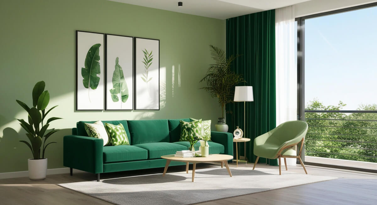
Lean on Cool Tones to Build Trust and Reduce Resistance
Credit: Alemedia.id
Blues and greens create a sense of stability and calm, which makes buyers more comfortable spending time evaluating a listing. That extra time matters because it increases the likelihood of deeper engagement, whether that’s scrolling through photos, reading details, or scheduling a viewing. When buyers feel at ease, they’re less likely to rush away from the decision.
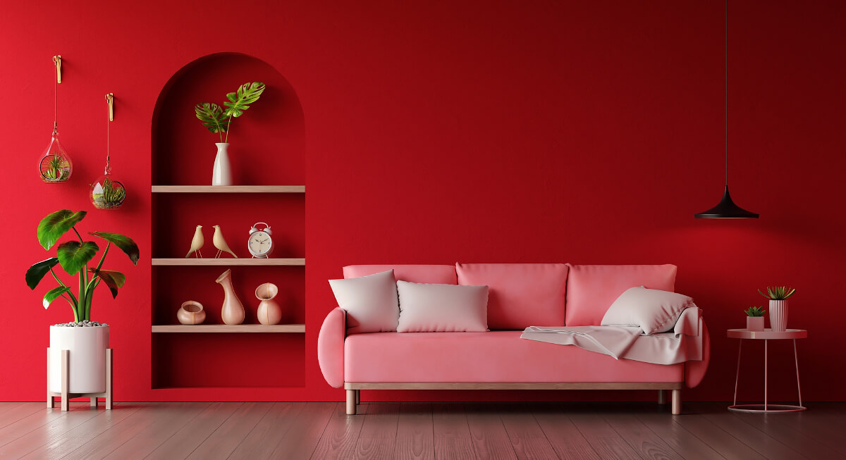
Use Warm Colors to Encourage Faster Decisions
Credit: wuttichaijanglab
In marketing materials and staging, warm tones like red, orange, and soft yellows create energy and movement that help push buyers toward action. When used in small, intentional ways, these colors can increase urgency without overwhelming the space.
Design High-Contrast Calls to Action That Stand Out

Credit: pexels
Color alone doesn’t drive clicks; contrast does. A button only works if it clearly separates itself from the background. For example, a red or orange button on a neutral page naturally draws attention, whereas a similar shade on a matching background fades into the background. In testing, simple color changes have doubled click-through rates.
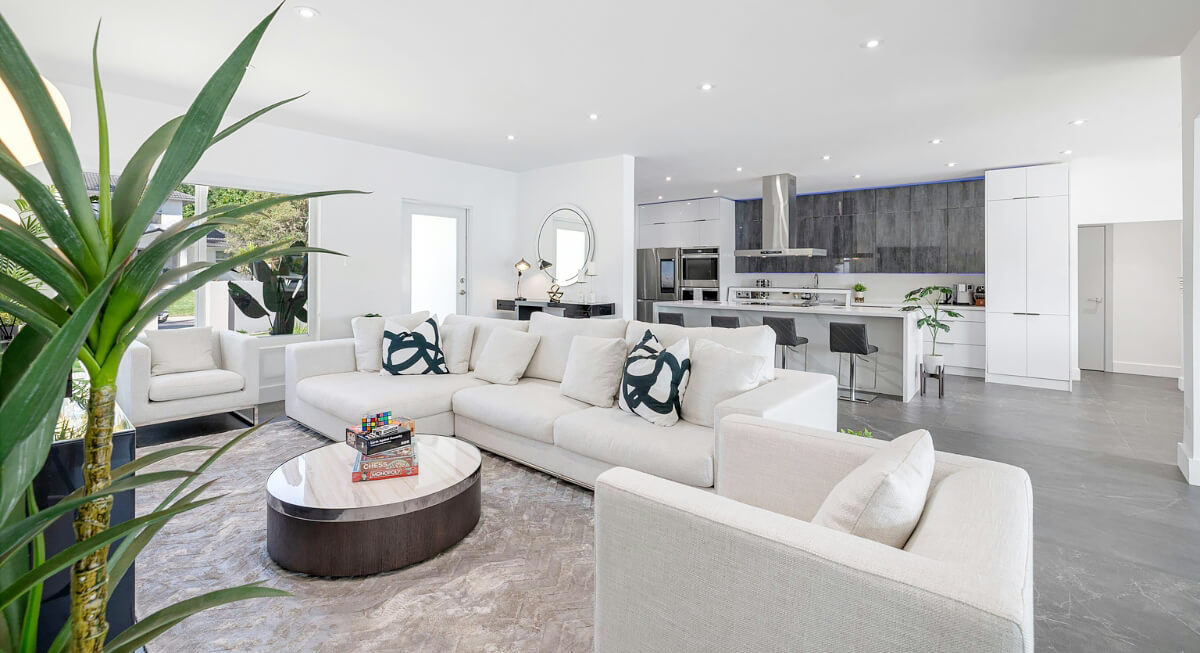
Use Neutral Palettes to Increase Perceived Value
Credit: pexels
Neutral colors like white, beige, and gray appeal to the widest range of buyers because they don’t impose a specific style. They allow buyers to picture their own furniture and lifestyle in the space. This flexibility increases perceived value, especially in competitive listings where buyers are comparing multiple options.
Optimize Exterior Colors for Pricing Advantage
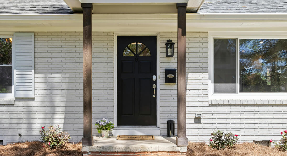
Credit: pexels
Curb appeal starts with color, and small changes can affect the sale price. Homes with black or charcoal front doors have been shown to sell for thousands above expected value, while pale blue tones also add measurable appeal. These choices photograph well and create a stronger first impression before a buyer even steps inside.
Use Accent Colors to Create Memorable Focal Points
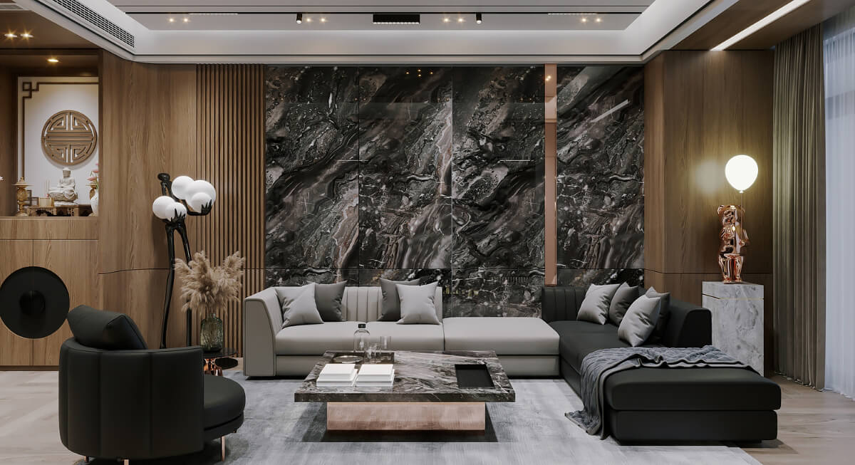
Credit: CGI STUDIO
A single accent wall or a well-placed color element can make a property stand out after a showing. Without it, many listings blur together. Strategic accents draw attention to key features and help buyers remember the space when they’re considering options later.
Structure Listing Photos for Visual Clarity and Engagement
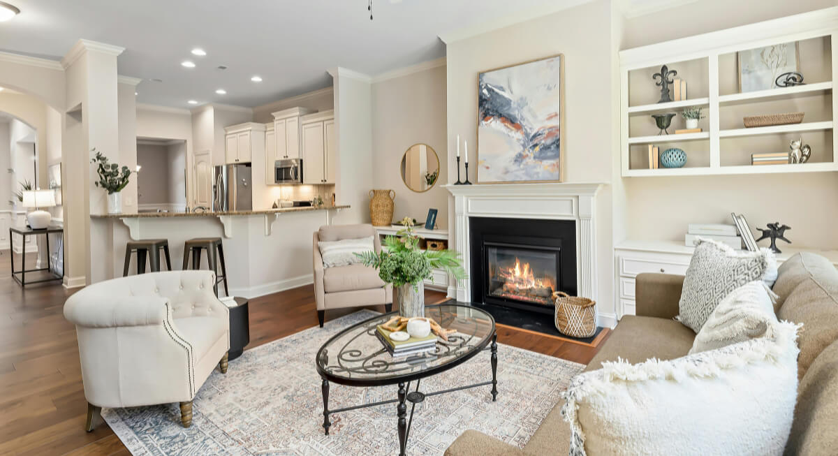
Credit: pexels
Photos need a clear visual hierarchy. Neutral backgrounds combined with one or two color anchors—like a sofa, artwork, or plants—keep the image clean yet interesting. Listings that maintain this balance often see significantly higher engagement, with some reports showing increases of 30–50% in interactions.
Match Color Strategy to the Target Buyer and Property Type

Credit: pexels
Different buyers respond to different visual cues. A modern apartment targeting young professionals benefits from clean grays and bold accents, while family homes perform better with warmer, softer tones. Aligning color with the expected buyer makes the property feel like a natural fit.
Test and Refine Colors Based on Real Performance Data

Credit: pexels
There’s no universal “best color.” What works depends on the market, audience, and property type. A/B testing different button colors, backgrounds, and layouts reveals what actually drives clicks and inquiries. In some cases, a simple color change can nearly double conversion rates, but the only way to find that advantage is through testing.